Brand Style Guide
K · A CORPORATE GROUP LLC
VERSION 1.0 · 2026
Brand colors
Three colors carry the brand: Navy as the dominant brand identity, Gold as the premium accent, White as breathing room.
Supporting Grays
Typografie
Inter — Open-source sans-serif by Rasmus Andersson. Fallback: -apple-system, BlinkMacSystemFont, sans-serif.
ExtraBold 800 — Logo & H1
Aa Bb K&A
font-weight: 800 · letter-spacing: -2.5px
Bold 700 — Sub-Headlines
Wirtschaftsberatung neu interpretiert
font-weight: 700 · line-height: 1.1
Semibold 600 — UI Labels
Markteintritt · Compliance · Tax
font-weight: 600
Regular 400 — Body Text
Wir beraten deutsche und US-amerikanische Unternehmen bei grenzüberschreitenden Vorhaben — von der ersten Strategie bis zur operativen Umsetzung.
font-weight: 400 · line-height: 1.6
Medium 500 letter-spaced — Tags
Transatlantic Advisory · DE ↔ US
font-weight: 500 · letter-spacing: 2-5px · uppercase
Logo-Varianten
Three core crest variants — all derived from the same concept, plus a horizontal wordmark layout for letters and signatures.
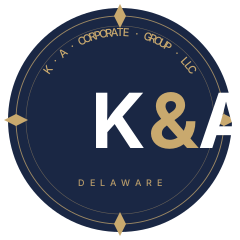
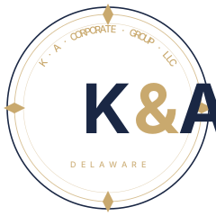
Horizontal Layout
Clear Space & Minimum Sizes
- Digital: min. 32 px width, recommended 48 px for touch targets
- Print: min. 12 mm width, 22 mm recommended for letterhead
- Schutzraum: min. ¼ of the logo height clear all around
Do & Don't
✓ Do
Preserve gold accents
Ampersand & diamonds are distinctive.
✗ Don't
Brand colors ändern
Not even "close" — use exact hex values.
✓ Do
Respect clear space
Min. ¼ of the logo height all around.
✗ Don't
Distort or rotate
K&A letters must stay upright and proportional.
✓ Do
Outline on white paper
Use the on-white variant for letters.
✗ Don't
Remove diamonds
The 4 gold marks are part of the brand DNA.
Kontakt
Questions about new use cases, modifications, co-branding with partners.
Brand portal: /brand/ · Version 1.0 · May 2026